15 Design tips to improve blog post performance
Even if the most important part of your blog is its content, the way it’s presented has a big impact on the conscious and unconscious decisions that your visitors will make while reading your posts.
- Will they explore other sections of your site?
- Will they subscribe to your newsletter and follow you on social media?
- Will they simply leave and never come back?
Here is a list of 15 design tips that will help improve your posts performance. Keep in mind that sometimes “less is more” and that your are not expected to apply everything that is on this list at once. We want you be mindful of the possibilities and implement what best applies to your context and audience.
1. Choose the right type of photography

Photography is a powerful tool that leads to emotion. Good photography will make your post look interesting and high quality. When choosing images for your post keep in mind the following things:
Have a goal — Don’t add a picture just because is pretty. Figure out its objective on the page and how it helps achieve it.
Always use high quality — Beware of bad lighting, blurry or pixelated photos. The quality of your pictures will be associated with the quality of your content. Great photography can really help out those posts where you feel the content was decent but not outstanding.
Be on brand — Be consistent amongst different posts and media. Respect your brand guidelines to strengthen your positioning.
Avoid stock images — Stock images are impersonal. They will make your posts feel cheap, uncreative and cliché.
But If you are really stuck with a stock image, make it interesting — Modify to service your brand. You can overlay a colour to it, adjust its levels, add lettering, or even mix it with an illustration.
2. Properly pair your typefaces
Look for good balance between your fonts. Clever font marriage between headings and body text is a powerful way to reinforce your editorial line and help accomplish the objectives of your readers.
Explore and have fun with sites like Type Connection, a game that portraits fonts as characters searching for their soulmates. This site will help you “send your fonts on the right date” by letting you explore different match strategies. While doing so you will learn a ton about typographic terminology and history.
3. Break your content

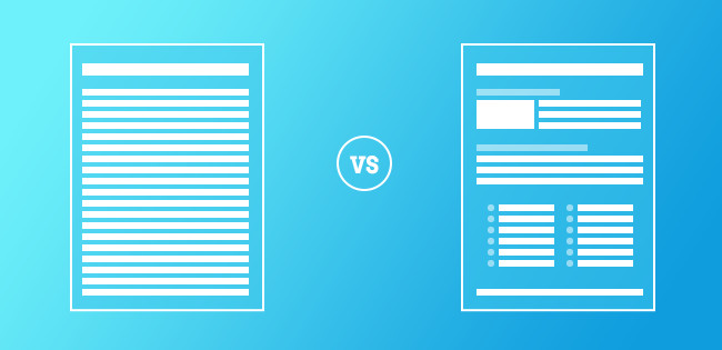
Provide your reader with content breaks. Long posts don’t have to be hard to read. Sub-headings, bulleted lists and photography are good ways to offer visitors some resting pauses and bring special attention to specific ideas within your content. Breaking your article into sections will improve the overall readability of your blog post.
4. Treat your post titles as design elements
While you don’t want to overpower you content, a visually interesting title has its own magnetic force and will suck your readers in. Accompanying your post title with an image could be just the right thing to persuade the reader that your article is worth their time.
5. Give a special treatment to your first paragraphs
Intro paragraphs are a good way to ease your readers into your content. A subtle, special treatment —slightly bigger font and drop-caps for example— will draw the attention of your visitor and will make your post go a long way.
6. Adjust your line length and column width
For optimum readability, fit between 10 and 12 words per line. More words require greater lateral eye movements which can be tedious to read. Less than 10 words would result in too many breaks within your text, interrupting the sentence structure.
Our eyes don’t read character by character, or even word by word. Instead, our eyes scan groups of three or four words. A reader can make 3 or 4 pauses like that on a line before it becomes tiring. When working with bulleted or numbered lists consider splitting your columns into 2 or 3 columns for better usage of the space.
7. Boost design of quotes, block quotes and pull quotes

These are a great ways to attract attention to specific points of your article. They are also good for the occasional skimmer that likes scanning posts. When done right —always in service of the content— they are excellent “shareable material” for your visitors.
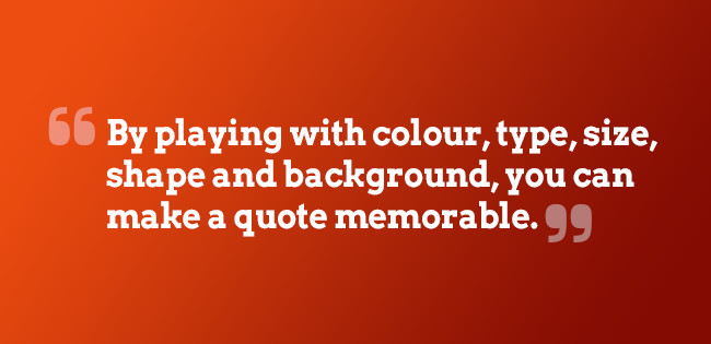
By playing with colour, type, size, shape and background, you can make a quote memorable. But don’t overuse them, limit your article to 1 or 2 pull quotes that will really stand out.
8. “Follow us” and “Share This” buttons
Instead of a global “share this page” plugin distracting your visitors from the page, identify “what” and “when” is worth sharing something from your post. Remember those block-quotes and pull quotes we talked about before? Add a nice “Click to tweet” icon within your block-quote. Place your “share this page” icons at the end of your post, after you have given your visitor enough reasons to share what you wrote.
Same thing for “Follow us” icons, keep in mind your visitors primary goal. Don’t greet them with oversized, colourful icons in the middle of your header. Keep them in your footer or sidebar if you will, but don’t overshadow everything else on your page.
9. Some things are not meant to stick out. And it is perfectly normal
Assume the fact that some elements on your page are not as important as others and that your content is what your visitors are there for. Make sure that additional information on your post —such as date, author name, tags— fit nicely into the design of your post without drawing too much attention from the rest of the text.
10. Related posts
Related posts are a great way to keep your visitors engaged with your content. Suggesting 4-5 five links to other related posts at the end of your text shows that you know about the topic without overwhelming your visitors with too many choices. Add a thumbnail picture along with the title of the text but make sure that all your images will fit the space properly. Don’t use a generic thumbnail or a stretch/cropped version of your pictures, if that is the case, you might want to stick to a bulleted list and no thumbnails.
11. Comment areas
Posts really come alive with engagement from your visitors. Encourage comments and conversations from your audience by taking the time to style the comments section and make them stand out. Let people know that you care about what they have to say by providing an user-friendly environment where they can share their thoughts regarding your post.
Highlight your own comments by changing the background or adding an icon, this will help people spot your replies quickly. Consider using Gravatar for avatar thumbnails, it’s always better to see people’s faces when having a discussion. Implement a pagination system if you start getting a high amount of comments.

12. Advertising
Although you are not able to control the design of the ads that appear on your blog, advertising networks give you the option of choosing which ads to accept into your site. Make usage of this possibility, only approve ads that are relevant to your audience and that are related to your blog’s editorial line.
13. Keep your sidebar short
The longer your sidebar is, the harder it will be to keep your readers focused on your text. When your visitor begins reading, you want them to continue immersing themselves all the way to the bottom of your post. A focused and engaged visitor will most likely translate into a new subscriber or a comment at the end of the page.
14. Calls to action
Call-to-action buttons can be the tipping point between conversion and bounce. Your visitors will have to go through them if you want them to download more information, fill out a survey, rate a product, or even going to another page. We won’t go into which colour works best or things like that, what actually works varies depending on the context and overall design of your page. Ultimately, it comes down to making your calls to action stand out from the rest of the elements in your post, so your reader can easily spot them.
15. Add richness to your posts
Add diversity into your posts to keep your blog interesting. Make usage of infographics, note cards, sketches, photo galleries, video and audio to offer a unique experience to your audience. Always be testing new things, compare which posts perform better and keep building on top of that.
Finally, for those who would like to dig a bit further into the suggestions above, here are some of the pages visited while doing research on the topic:
- Fonts.com > Line length and column width
- Smashing Magazine > Block Quotes and Pull Quotes: Examples and Good Practices
- Nathan Barry > 7 techniques to design killer graphics on your blog
- InvisionApp > 8 Tips on choosing the right photos for your design
- Type Connection > A typographic dating game
- Click to Tweet
- Tutsplus.com > A beginner’s guide to pairing fonts
- Avocado Social > 5 examples of how to integrate social media into your website
- Hongkiat > Comment Design: Considerations, Best Practices and Examples
- Unbounce > How to design call to action buttons that convert
- Pro Blog Design > Let readers read in peace
If you found this article helpful, share the experience with other people.


